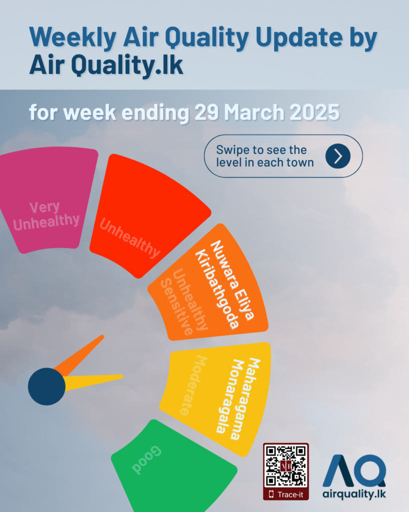
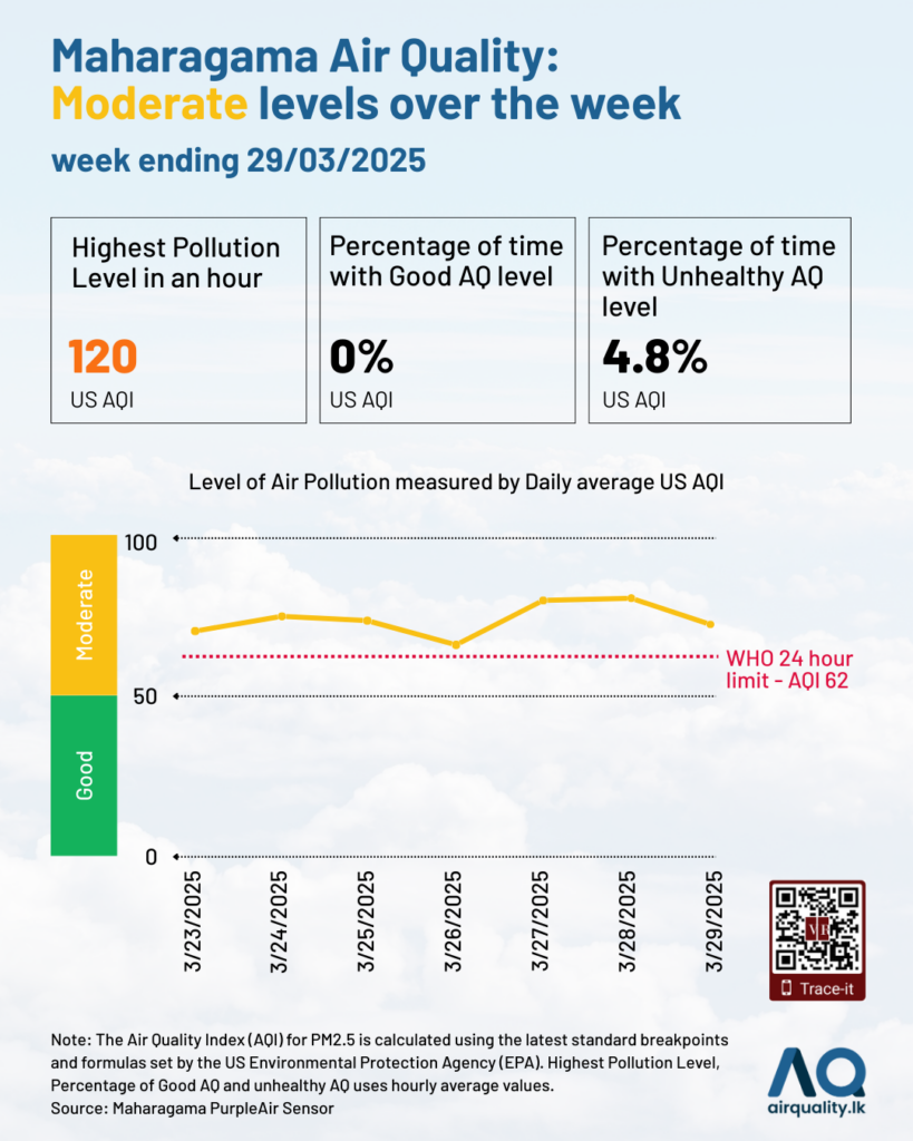
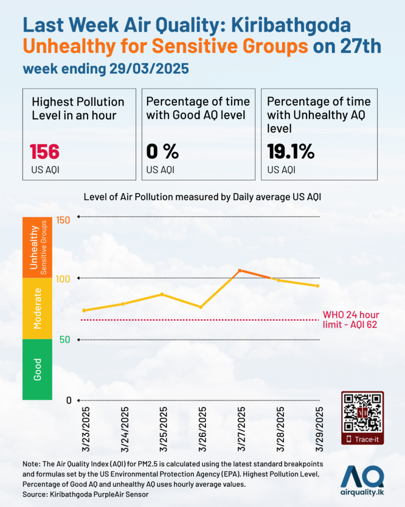
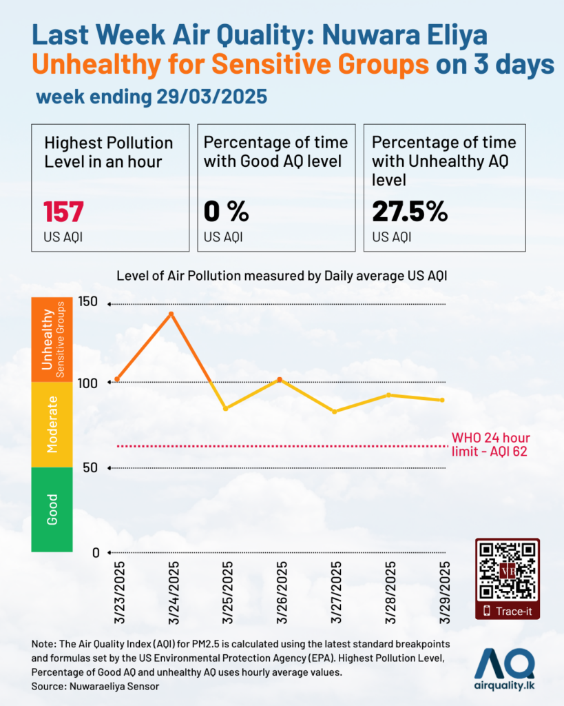
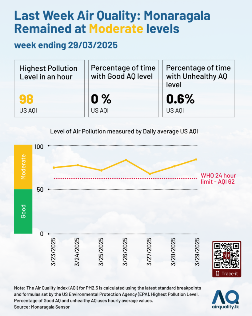
The solid line in the graph shows the daily average Air Quality Index (AQI), derived from hourly data. A daily average is calculated only if at least 75 percent of the hourly (or per-minute) data is available for that day.
The summary statistics—including the highest pollution level (AQI), the percentage of time with good air quality, and the percentage with unhealthy air quality—are based on hourly AQI values. For instance, a peak AQI of 154 indicates that, during the week, there was at least one hour when the NowCast average reached this level, categorised as “unhealthy”.The percentage of time with good air quality reflects the proportion of hours during which the AQI remained between 0 and 50 (PM2.5: 0–9 µg/m³). Conversely, the percentage with unhealthy air quality refers to periods when the AQI exceeded 100, a level considered unsafe for sensitive groups (PM2.5 value >35.4 µg/m³).
According to the World Health Organization (WHO), the safe limit for PM2.5 is a 24-hour mean of 15 µg/m³, equivalent to an AQI of 62 as shown in the red dotted line. This threshold should not be breached if the air is to be considered safe for breathing over a full day. Notably, none of the continuously monitored locations during the week met this standard.
Research by: Akshayvisnu Ramanathan and Anushan Kapilan
Visualisation by: Muaadh Himaz
